Since the flash project has been nixed, I found myself trying to connect the Buxton to reading to our digital video projects. How might simple animation be useful? The first thought was of course if we were doing animations or telestrations. However, the client wants us to focus on video interviews. While Dr. Howard urged us to work on sketching storyboards initially, I think that they are actually more useful after the raw footage has been shot.
Case in point: I actually storyboarded my podcast after doing my interviews because interviews are unpredictable. You don't know what you need yet and while you can get a good feel for what will make great sound bites, it sometimes doesn't work within the frame that you need it to. I had lots of great quotes, but since I was tackling a complicated industry (instructional design), I found that even my interviewees had a difficult time of articulating my questions in a succinct and clear way. That sort of clairty usually only comes with writing and revising. However, you don't want it to sound canned, so you deal with the fact that some answers are round about.
So I listened to all my footage and then outlined the podcast based on what I had. It's hard to work from nothing sometimes.
That thought brings me to using gifs of digital video to create a rough storyboard. I know that we will end up with much more footage than we need. In a previous video experience, I had hours of footage that I boiled down to a 4 minute video. My team has two interviewees lined up and I imagine that the interviews will be no less than 30 minutes. I think using Buxton's concept of using gifs to sketch out an experience will be a great tool here.
I think it will be beneficial to get one team member to take photos or perhaps stills from our footage so that we can get an idea of how we want the video to flow. Once that's finished, it'll be much easier for us to edit in Adobe Premiere. I think the power of gifs are underestimated because they are used for humor so much on the internet. However, they can be a powerful narrative tool. Take this review of 50 Shades of Grey completely in gifs. It's funny, but it also says a great deal about the book itself.
http://www.goodreads.com/review/show/340987215
Sunday, November 3, 2013
Sunday, October 27, 2013
The Trouble With Lighting
I recently read an article about the film 12 Years a Slave and the lighting that was used for many of the black actors. There was another actress, Viola Davis, commenting on the performances of these actors and whether or not the film did justice to lighting black skin. It's no secret the high level of bias in Hollywood, but I bring this up because of what Holben off-handedly mentions in his blog:
"As explained in Chapter 3, my artistic preference is to often put Caucasian faces at about a stop below key..." (Holben 128).
For a moment, I was excited because I thought he might go on to discuss lighting in terms of different skin colors. He makes the distinction in his writing, but never actually elaborates. What it implies is that there are lighting set ups that work better for Causcasians and others that work better for people of color. I'm going to focus on the rhetoric side of this for a moment because I believe it's important to point out the sort of thinking that is going on here.
In film history, people of color are not at all well represented. It wasn't untill we had more advanced equipment that people of color are protrayed with any sort of justice. Black and white film has this ethos of timelessness and it screams classic to many, but it was far from it for actors of color. Black and white just can't capture the lighting and various tones in pigmented skin. It looks washed out and dull. I won't even go into the politics of white actors playing other races...
So I have to wonder, why is Holben repeating this distinction that he says was mentioned in chapter 3? Until this point, I considered this book to be a guide for general lighting techniques, but I'm bothered by his need to distinguish between lighting situations for Caucasians without actually delving into the background of why that is. Whether by choice or not, many of the examples I've seen in this book uses white models.
How would you like a scene with someone who had very dark skin? That has to be important information. I think that this speaks to representation... And since this course is about digital media and rhetorics, you'd think the worst of print and analog media would be left behind. However, I think many issues of representation have carried over instead.
Sunday, October 20, 2013
Detroit Versus Public Transportation
Heath and Heath's book Made to Stick was something I wish I had read before the distance education module. I found much of what they were talking about very relatable to teaching. In fact, I hope that I can use some of these techniques in this semester and next semester for my ENGL 1030 class. I felt as if I was very prepared going into teaching from such a strong tutoring background, but it's such a different way of thinking all together. Heath and Heath provided some perspective on that for me.
Much of the reading focused on outlining some of the principles that make for successful ideas. These ideas stick and we remember them. I hadn't thought about why some ideas don't work and others do, but its actually very fascinating. Often, when I consider great ideas that somehow miss the mark or need to be appropriated by everyone, I end up feeling frustrated. However, now I can begin to reason it out. For instance, at the rate we're going, the use of cars in most American cities will continue to overpollute the planet. Public transportation is a great idea, which was sqaushed hard in Detroit. The Big Three weren't having it and as result, public transportation is almost non-existent. I think making changes in terms of transportation didn't take off in Detroit (aside from the auto industry's interference) was in part due to the lack of simplicity.
What would public transporation look like in Detroit? An intricate bus system? More taxis? Construction of subways?
Second, there was nothing new or unexpected about the idea. Other cities had models for great public transportation. While in London, I was surprised how easily I adapted. But what would make it work for Detroit?
Any plans that came up over the years lacked concreteness. Then again, how do you completely convey the overhaul of a city's transportation system in a concrete way? The auto industry attacked the credibility at every turn. People in Detroit think not having a car would be a nightmare because they know no other way.
The only emotions tied to this issue was the fact that people were strongly against it. I'm not sure if there were any grassroots organizations or organizers behind the push. And finally, there were no stories. People don't take to logic very well, especially in the form of abstract numbers and plans and projections. My other thought on making ideas stick was concerning the group graduate student guidebook. How does one make Clemson appealing? The idea of going there stick in their minds? It somehow did for me even though it was the furthest school of my choice. I think that my group needs to come together and work on revisions with this in mind.
Tuesday, October 15, 2013
Design for the Wild
For this week's Buxton reading, I was particularly interesting in this idea of design for the wild. Buxton talks about this in terms of how we need to understand the larger context of use. Many of the things I will discuss in this blog are responding to Buxton's thoughts:
"...In order to design a tool, we must make our best efforts to understand the larger social and physical context within which it is intended to function...Without informed design, technology is more likely to be bad than good," (37-8).
The first part of this text shows Buxton's understanding of how the rhetorical situation applies to nearly any situation. This includes creating GPS equipment for finding trapped skiers that will work when it needs to. One of the things he mentions is how technology can fail in the wild because the conditions in nature aren't accounted for in the lab. This is very important. I think context of use sometimes gets overlooked especially when we look at technology.
For instance: Cell phones are disgusting if you consider the context of use. They go everywhere and get touched by many hands. There are probably more germs on your cell phone than there are on a public toilet seat. Just in terms of public health, I'm not sure if this has been explored enough by manufacturers of cell phones or the people who sell them. There are very few products on the market right now that target keeping your cell phone clean. If you're a germaphobe like me, then you try to wipe the outside down with rubbing alcohol. However, I have to wonder if that is the best thing for my screen... Probably not.
I also want to discuss the second half of the quote, which talks about informed design. I have to say I am mad at Buxton. Let me tell you why: I've been working on sketching my portfolio website. I have tons of designs and page layouts that I've been sketching. However, I found I couldn't quite get started so I began working on title concepts for m portfolio. I noticed that most people have their names in the previous portfolios. I wanted to go beyond that and pick a name that would encompass the purpose and aim of my portfolio. One of my final choices was "Informed Design." (It's officially claimed by me now, I'm going to copyright this). I thought that informed design is a great concept because it illustrates how all of my designs in the portfolio are informed by rhetoric or theory. I really want to emphasize that my choices are not out of the blue decisions without rhyme or reason. And I think this gets lost sometimes in industry, or at least, it doesn't get articulated in ways that it should.
So, even though Buxton beat me to this. I was excited that he brought this up because I think it also adds depth to my original understanding of informed design. Context of use is very important and if you don't consider it, then it's easy to end up with bad design.
This leads me to consider: What will be the context of use for my portfolio website? I think maybe there might be a need for a mobile or iPad version. In particular, I think an iPad version would be great to take on job interviews so you can easily pull up your own website.
Sunday, October 6, 2013
Using Stories to Share Knowledge
The second half of the Squirrel Inc., (even though I've read it all before) helped drive home the need for stories and examples in teaching. Teaching has been very much on my brain this semester because of the two sections of ENGL 1030 I'm teaching. On the whole, I love teaching, but I sometimes struggle with finding the right way to convey knowledge and help students learn. Everyone learns differently. How do you address that?
I'm still figuring that out, but I know for me it is easy to learn when I have examples to refer to. I took that approach with scripting my video for the distance educational module. I watched a great deal of TechSmith videos and just happened to see how they lay out their script. It was brilliant! It helped me organize my thoughts and the progression of my video.
Because of that, I was able to decide that I wanted to share examples and little mini stories to convey the concept of mimicry. I used the story of how velcro was made as an opener. However, because of time constraints, I had to do so in a way that still conveyed the idea of problem solving design issues using mimicry. That was the core part of my module's message. Denning writes, "a knowledge sharing story is about finding the solution to a problem by way of an explanation." This idea really speaks to my learning style and so I thought I would have a stronger module by teaching mimicry this way.
Finding examples to convey the three types of mimicry was a blast for me. I was particularly excited to incorporate my favorite video game: The Sims 3.
I think an important part of knowledge sharing that I don't think Denning addreses (granted in the workplace this may not be as important, but it is in education settings) is the idea of where the knowledge comes from. I tried to be very transparent about my sources and the sources of my images. I list my image sources on each slide and also provide a works cited list for the audience. The video captures were my own. I created them for this video.
This is something I try to convey to my students. I think I need to work on showing them the sources of my knowledge... especially when I'm trying to convey that to them. I'm still working on that though.
Friday, September 27, 2013
The Power of Stories
Squirrel Inc. is a story about the power of storytelling in organizations to spark change. Even though I've read this cover to cover before, I'm still amazed at how much of a quick and captivating story this is for the reader. While it vaguely reminds me almost of something you might see produced by Disney, it has wide audience appeal. I wish I would have had this working in past internships where the organization clearly needed to move in a new direction.
So what is the take away from Squirrel Inc. I would say that first and foremost, stories matter. In fact, I found myself talking about this in my class. In order to grasp the attention of your audience, I explained to the students how a narrative approach would effective. This is especially true in terms of what your main purpose is for the audience. If it is to get them to do something, then following the structure of stories that are calls to action would be best. While we spent much time in workplace communication talking abotu stories in the context of the workplace, I think it has value elsewhere too.
As I reread this book, I tried to look at it from a different perspective. Since we're working on the distance education module next, I wondered how I might incorporate a story into my topic. My first instinct was to use a story at the beginning as an attention grabber. However, I began to wonder if that would be the most effecitive. Especially we have two minutes to educate someone. The temptations to hit all the major points in a cute and dry way is very huge. So, how do I balance being engaging without drawing out the lesson well beyond the two minute mark?
I skipped around to the section on sharing knowledge. In a sense, this is what we're doing. We are trying to teach a concept or share our knowledge about something with the audience. Denning writes that, "The knowledge-sharing story is about finding the solution to a problem by way of an explanation. It's quite different from a story about heroes and heroines and their triumphs and tragedies. A knowledge-sharing story tells of the pursuit of the truth. It's wrestling with problems and securing their solutions. It's the excitement of science. It's the delight of finding things out," (90).
A shark went off in my head after that. My topic lends itself to exploring a knowledge sharing story format. My research on Mimicry has mostly lead to biology and nature based articles, books, and web pages. However, there are many stories about mimicry in the design and usability side of the research. In effort to share knowledge about using computers, early designs mimiced the things that people were already familiar with. I think this will be a good route to go as I continue working on the distance education module.
Sunday, September 22, 2013
You-Attitude
One of the things that struck me about chapter 6 was Weinschenk's discussion about why "you centric" communication is more effective not only in web design, but also in marketing and other related industries. I remember learning about this technique as an undergraduate in a busincess communication class. We had to write in various business genres like proposals, letters, reports, etc with a "you attitude." That is, the writing was very focused on the audience. At the time, I could fully understand why it was necessary. However, I think that Weinschenk does an excellent job of giving some concrete reason for why this works so well.
The old brain is quickly becoming my favorite part of the brain. I love food and this chapter goes a long way toward explaining why websites like FoodGawker are so popular.

I love stuff like this. Even better, it's not just mindless food-porn. When you click on the photos they take you to the actual recipes for the food pictured.
In chapter 7, the idea of committment explains why Facebook is so popular. I think of this in terms of the users who post committments publicly. For example, many people tend to post their new years resolutions on Facebook. This actually worked for some of my friends. They used Facebook as a way to build in accountability. Committing to lose weight is more effective when you feel like you have someone keeping tabs on you.
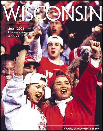
It wasn't untill chapter 8 that I saw a way to relate this week's reading to our current client project: the Graduate School Guidebook. Similiarity is important and I think for most people they don't have an issue with it. However, people of color and even international students would probably find the content of most of the images severely lacking. There's a fine line that needs to be addressed. Clemson isn't the most diverse school by a long shot in terms of undergraduates. I have to wonder about the graduate school with possibly a larger international population to change the statistics. I would really like to address the area of diversity by using a more diverse range of images that feature various representations of graduate students. At the same time, how do you do that without falsely representing the truth?
Afterall, Clemson University isn't that diverse and the level of diversity depends on the department and college. The surrounding area varies and the upstate in general isn't a pillar of acceptance and celebration of diversity.
So is there a solution? I'm not sure yet, but I don't want to end up with poorly doctored images like this:


The old brain is quickly becoming my favorite part of the brain. I love food and this chapter goes a long way toward explaining why websites like FoodGawker are so popular.
I love stuff like this. Even better, it's not just mindless food-porn. When you click on the photos they take you to the actual recipes for the food pictured.
In chapter 7, the idea of committment explains why Facebook is so popular. I think of this in terms of the users who post committments publicly. For example, many people tend to post their new years resolutions on Facebook. This actually worked for some of my friends. They used Facebook as a way to build in accountability. Committing to lose weight is more effective when you feel like you have someone keeping tabs on you.
It wasn't untill chapter 8 that I saw a way to relate this week's reading to our current client project: the Graduate School Guidebook. Similiarity is important and I think for most people they don't have an issue with it. However, people of color and even international students would probably find the content of most of the images severely lacking. There's a fine line that needs to be addressed. Clemson isn't the most diverse school by a long shot in terms of undergraduates. I have to wonder about the graduate school with possibly a larger international population to change the statistics. I would really like to address the area of diversity by using a more diverse range of images that feature various representations of graduate students. At the same time, how do you do that without falsely representing the truth?
Afterall, Clemson University isn't that diverse and the level of diversity depends on the department and college. The surrounding area varies and the upstate in general isn't a pillar of acceptance and celebration of diversity.
So is there a solution? I'm not sure yet, but I don't want to end up with poorly doctored images like this:

The original
What was published
Subscribe to:
Posts (Atom)